


![Aventura luxury condo market 2026 [June]: What Sellers and Buyers Need to Know Right Now](https://luxlifemiamiblog.com/wp-content/uploads/2026/06/Pricing-39-150x150.png)
![Aventura luxury condo market 2026 [June]: What Sellers and Buyers Need to Know Right Now](https://luxlifemiamiblog.com/wp-content/uploads/2026/06/Pricing-39.png)
- Best of All
- Best Miami Luxury Condos
- Most popular
- Relocating to Miami
- Private Schools
- Investments
- Gated communities
- Waterfront information
- Luxury homes
- Luxury Condos
- New Construction Condos in South Florida
- Independent Pre-Construction condo reviews for Miami
- Independent Pre-Construction condo reviews for Fort Lauderdale
The Q1 2020 Miami Real Estate Report: How to Read our Advanced Software for Predictive Analytics
Part 5: Our Advanced Analytical Tools
Welcome to Part 5 of the Q1 2020 Miami Real Estate Report. In this section we explore the tools that myself and my team use to ‘Help Clients make better decisions’. We reveal the metrics used in this report to make the narrative and conclusions over what is happening and why it is happening.
Now more than ever we need optics to understand what is going on and what could potentially happen in our real estate markets. The stock Market, Covid-19, interest rates; these all play macro roles in our real estate economy, but they are not the only forces at play. In part 6 we will explore the macro influences as well as the micro influences at play in 2020. However, please know that when we are reading and analyzing the Miami markets we are using tools that help us paint a more complete picture.
I have been studying and reporting on the Miami Real Estate market for over a decade now. Ever since my first report on Brickell in 2010 I have been searching for better ways to read the markets and thanks to technology I have not only been able to write on the market, but to create analytical tools and software in the form of dashboards to tell clients (both buyers and sellers) what is going on. As Warren Buffett so accurately put it…
“If you can’t read the scoreboard. You don’t know the score.
If you don’t know the score, you can’t tell the winners from the losers.”
So here are the tools I have used in my Q1 report to help understand the markets and once you see them too you also will be able to understand the markets better!
The NEHS or Neighborhood Economic Health Score
To better understand the neighborhood of your choice we offer the Economic Health Score Indicator on our “Live Analytics” page. This neighborhood health score indicates the current economic health of an area and its likelihood to fall ill or to be susceptible to illnesses. With other words: This is a score to gauge how healthy or weak a market is. So this score does not predict the future, it merely provides the current status of a market and provides you with an indication of the market’s defense mechanism aka: its strength to process future hits. It is not about bear or bull markets. It’s about the market’s elasticity; about robustness and resilience of the market against economic change.
The Advanced Analytics Screens
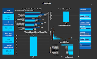
Our advanced analytics page offers you the possibility to see the market statistics of homes or condos in some of Miami’s most desired neighborhoods. You can choose the type of property, the neighborhood, the property style (waterfront, dry lot or new home -3 years or less), and a price range. The system will then provide you with quarterly data (going back 6 quarters or 1.5 years) on average sales price per SF, Months of Inventory, number of closed listings, number of active listings and days on market. As the graph shows the last 6 quarters it gives you a great idea of how the market has performed over time. For each of these screens David will add narrative with his day-to-day experience in this market or particular sales to provide you with a more holistic overview of the market.

Condo Geeks Dashboard
The Condo Geeks dashboard is by far the most advanced of the tools we have created. This is the brain child of my partners and myself to create a visual representation of the markets and specific condos. What would have previously taken hours or more likely days to analyze and format, can now be accomplished in mere seconds! This tool is not simply pulling data live from the MLS and collating it into easy to understand charts. It has been scrapped meticulously to remove anomalies as well as filling in gaps that the mls did not record through cross referencing with the Florida Tax Role. Simply put it’s much more accurate.

FAQ
These are the most commonly Miami Real Estate Related questions
What should relocation buyers know before buying real estate in Miami?
HOME BUYERS
Relocation buyers looking at homes in Miami should understand that choosing the right house is less about the property itself and more about location, schools, and long-term value. Many buyers make the mistake of focusing on price or finishes, while the real driver of value is the neighborhood and micro-location. Older homes often represent better value, but may also be part of a future redevelopment cycle. Newer homes command premiums, but don’t always sell faster if pricing is ahead of the market. Commute time, school access, and community dynamics are critical and often underestimated. The key is to evaluate homes not just as lifestyle purchases, but as long-term assets within a very localized market.
Sources:
https://luxlifemiamiblog.com/relocating-to-miami/
https://luxlifemiamiblog.com/relocating-to-miami-with-a-family/
CONDO BUYERS:
Relocation buyers should understand that Miami is a highly segmented, building-driven market, not a uniform one. Pricing can vary significantly between similar properties depending on building quality, layout, and financial health. Many buyers assume newer construction equals better investment, but that is often not the case. Factors like HOA fees, reserves, and rental policies can materially impact long-term value and liquidity. Negotiation opportunities often exist, especially in slower segments, but require precise market knowledge. The key is to evaluate micro-markets and individual buildings, not just neighborhoods or price per square foot.
Sources:
https://luxlifemiamiblog.com/miami-real-estate-market-report/
https://luxlifemiamiblog.com/new-construction-miami-guide/
What are the best areas for relocating families with children
For families relocating to Miami with young children, the most recommended neighborhoods are Coral Gables, Coconut Grove, and Pinecrest. Coral Gables offers the best balance of top schools, safety, and long-term value. Coconut Grove is ideal for younger families seeking walkability, greenery, and a lifestyle-driven environment. Pinecrest provides larger homes, excellent schools, and better value for space, making it ideal for growing families. The key driver across all three is access to strong schools and primary residential stability. Relocation decisions are less about new construction and more about long-term livability and resale strength.
Sources:
https://luxlifemiamiblog.com/best-neighborhoods-miami/
https://luxlifemiamiblog.com/what-are-the-best-family-neighborhoods-in-miami-in-2023/
Are new construction condos in Miami a good investment?
New construction condos in Miami can be a good investment—but only if you understand that not all buildings perform the same. According to the David Siddons Group, many buyers assume “new = better,” but in reality, performance depends on pricing, layout, building quality, and long-term demand. Some new developments set future price benchmarks and can drive long-term appreciation, especially in top-tier projects. However, many are priced aggressively at launch, and buyers relying on marketing instead of data often overpay.
The market is highly segmented, meaning two new buildings next to each other can perform very differently.
The best opportunities typically come from selecting the right building early or negotiating correctly in later phases.
In short: new construction is not automatically a good investment—it becomes one only with building-level analysis and disciplined entry pricing.
Sources:
https://luxlifemiamiblog.com/how-to-buy-a-luxury-condo-in-miami/
https://luxlifemiamiblog.com/category/independent-new-construction-condo-reviews/
https://luxlifemiamiblog.com/beyond-clickbait-real-insights-into-miamis-luxury-condo-market/
Why is buying a Miami condo riskier than buyers think?
Buying a Miami condo is often riskier than buyers expect because the true risks are at the building level—not visible in the listing price. Many buyers focus on finishes and views, while overlooking HOA reserves, insurance exposure, and potential special assessments. In reality, two identical units in different buildings can perform completely differently over time. Rising HOA fees and stricter regulations are also increasing the true cost of ownership, especially in older buildings. Liquidity can be affected by factors like financial health, rental policies, and ongoing repairs. The key risk is not the condo itself—but buying into the wrong building without proper due diligence.
Sources:
https://luxlifemiamiblog.com/how-to-buy-a-luxury-condo-in-miami/
https://luxlifemiamiblog.com/miami-condo-market-risks/
What are Miami's Safest Areas?
Which Miami Areas Still offer Great Value (Budget Friendly alternatives to Coral Gables and Pinecrest)
If you’re looking for better value than Coral Gables or Pinecrest, the answer (in true Siddons style) is not “go cheaper”—it’s go one layer outside the obvious markets.
The strongest value plays are:
- Schenley Park → closest substitute to Coral Gables at ~20% discount while maintaining similar character and location
- Biltmore Heights → almost identical feel to the Gables but ~25–30% cheaper on a $/SF basis
- Glenvar Heights → central location with larger lots and ~25% pricing advantage vs South Miami/Gables
- Baptist / Galloway (Kendall) → Pinecrest-style living (space, schools, land) at up to ~30% lower pricing
The pattern is consistent:
👉 Buyers are shifting west and slightly off-market to gain land, scale, and pricing efficiency. You don’t find value by going to a “cheaper neighborhood”—you find it by identifying adjacent micro-markets that offer the same lifestyle fundamentals without the brand premium.
Sources:
https://luxlifemiamiblog.com/best-value-neighborhoods-miami/
https://luxlifemiamiblog.com/category/miami-neighborhoods/
Is NOW a good time to buy in Miami?
Are Miami real estate prices going down in 2026?
No—but that’s the wrong way to look at it. Miami is not one market anymore, so prices are not moving in one direction. In 2026, the market is split into two: ultra-luxury, scarcity-driven areas (like waterfront and top-tier neighborhoods) are still holding or even rising, while mid-tier condos and oversupplied segments are flat or correcting. What we’re seeing is price divergence, not a crash—some properties are gaining value while others are quietly adjusting downward. Rising inventory and more selective buyers are putting pressure on pricing in certain segments, especially older condos or buildings with weaker fundamentals.
At the same time, global wealth and cash buyers continue to support pricing at the top end of the market. So the real answer: prices aren’t broadly dropping—they’re being repriced based on quality, location, and supply.
Should I buy a house or a condo when relocating to Miami?
The decision comes down to lifestyle first, investment second—and most relocation buyers get that backwards. If you want space, privacy, schools, and long-term family living, a single-family home in areas like Coral Gables or Coconut Grove is typically the stronger choice. If you prioritize walkability, low maintenance, and proximity to business districts, a condo in Brickell or waterfront markets makes more sense.
From an investment perspective, homes tend to be more stable, while condos are more building-dependent and cyclical. Most relocation clients underestimate how much building quality, HOA structure, and future costs impact condo performance. The right answer isn’t “house vs condo”—it’s which asset fits your lifestyle AND holds value within its micro-market.
How do I choose the right Miami neighborhood for my lifestyle?
Why are Miami condo prices so different between buildings?
Miami condo pricing varies widely because value is determined at the building level, not just by location. Two buildings next to each other can have major differences in financial health, reserves, HOA fees, and management quality. Buyers also pay premiums for better layouts, views, amenities, and newer construction—but not all “new” buildings perform equally. Factors like rental policies, upcoming assessments, and building reputation can significantly impact resale value. This is why price per square foot alone is misleading in Miami’s condo market. The real driver of value is how that specific building competes within its micro-market over time.
Sources:
https://luxlifemiamiblog.com/how-to-buy-a-luxury-condo-in-miami/
https://luxlifemiamiblog.com/category/independent-new-construction-condo-reviews/
WHY WORK WITH DAVID? THINGS YOU SHOULD KNOW...
For all our analytics we are agents driving some very unique and advanced tech. We Provide a granular and custom experience that empower our clients with the insight and tools to understand the most complex behaviors of any local markets.
-
Analytical
Over 100 reports produced to date
-
Knowledgeable
Over 1800 published articles and counting


Related Articles

Bal Harbour & Surfside Real Estate Market Q1 2026

Coral Gables Real Estate Market Q1 2026
Kendall Luxury Real Estate Market Update Q1 2026

Miami Real Estate Market Report Q1 2026: The Two-Market Reality Driving Prices

Sunny Isles Real Estate Market Q1 2026

Pinecrest Real Estate Market Update Q1 2026

Aventura Real Estate Market Report Q1 2026

Brickell Real Estate Market Report Q1 2026
Coconut Grove Real Estate Market Q1 2026 (Updated April 2026)

South of Fifth Real Estate Market Report Q1 2026

Miami Real Estate in 2025: 10 Defining Lessons Buyers, Sellers, and Investors Can’t Ignore

The Myth of the Miami Real Estate Bubble: What the UBS Report Gets Wrong — with Analyst Ana Bozovic

Best and Worst Performing Condos in Coconut Grove in 2025

Miami Condo Market Trends 2025: What the Data Really Says with Craig Studnicky
Please fill in your details and David Siddons will contact you
Search related videos

Investing in Miami’s New Condo Construction Market Education
Insights on Miami Real Estate Trends: A Discussion with Eli Beracha Professor of Real Estate Education
Fort Lauderdale Real Estate Forecast | Market Predictions for 2024 Education
2024 Miami Real Estate: Top 10 Predictions & Trends to Watch! Education
Leveling Up in Real Estate with Alvaro Nuñez Education
Miami Real Estate 2024 Forecast! #BetterDecisions CondoMarket
Correct Miami Real Estate Predictions For 3 Years Straight! With Ana Bozovic Education
Miami’s Luxury Condo Market: Fact From Fiction! With Craig Studnicky #BetterDecisions CondoMarket
Miami Housing Market Crash 2023/2024: DEBUNKED! Education
Is The Miami Luxury Housing Market in Trouble? Forecasting The 2024 Real Estate Market! Education
Miami Real Estate Forecast | Miami Real Estate Market Predictions for 2023 Education
As the Miami Real Estate Markets Shifts, Who is Vulnerable? Education


- Get our Newsletter
- Subscribe
- No Thanks
Get the latest news from Miami Real Estate News
Close
Edit Search
Close
2 of 14
Share this property
Recomend this to a friend, just enter their email below.
Close
Your email was sent successfully
Close
 COMPARE WITH CONDOGEEKS